
3 UI / UX Improvements for The Bitcoin Company and How to Implement Them
This is part of the interview process for Senior Frontend (React Native) Developer position in The Bitcoin Company.
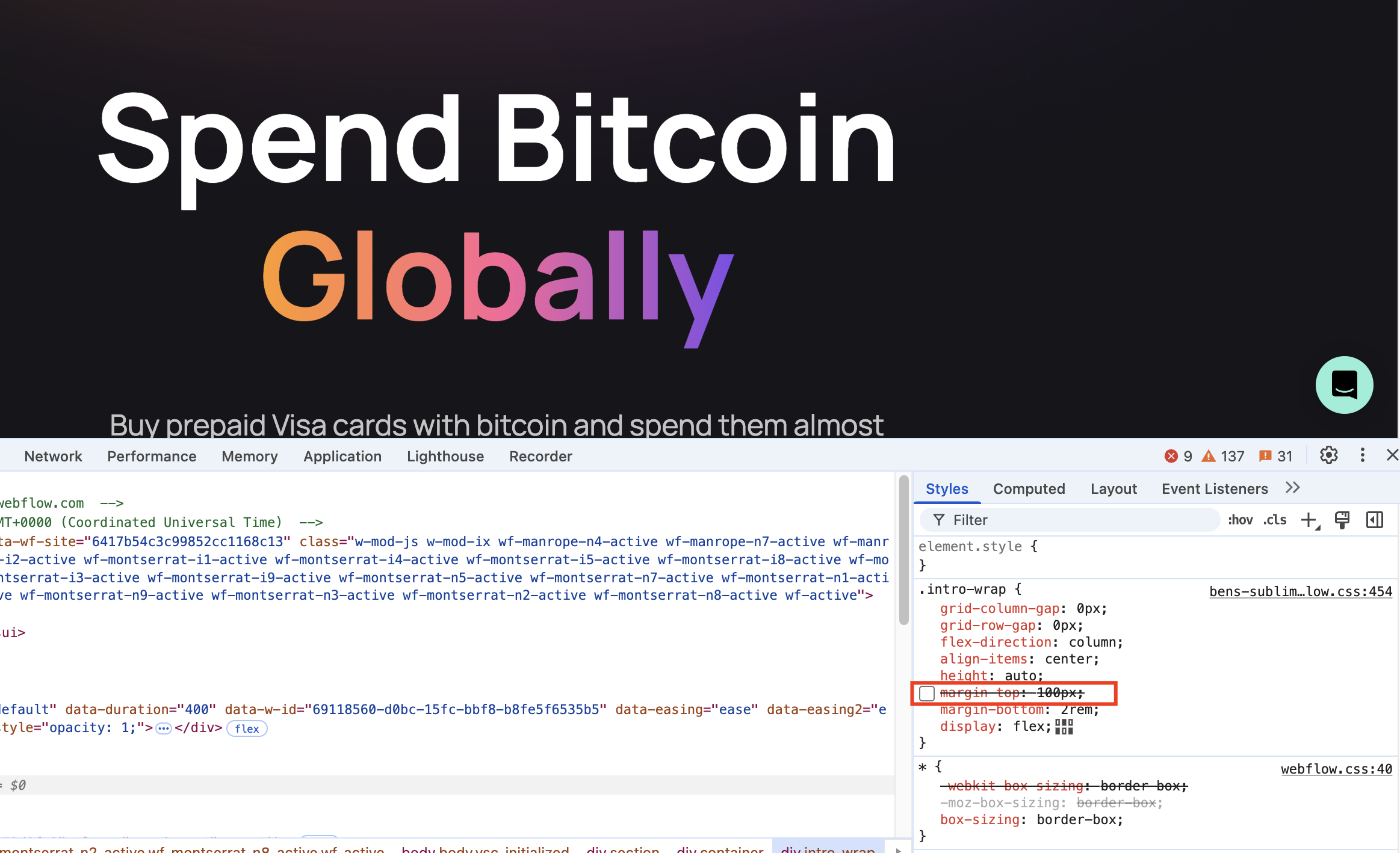
1. Call-to-Action Buttons Above the Fold
A tiny but important design principle is to put call-to-action buttons where users can see them right away after entering the page. This helps turn visitors into customers. When users can see these buttons without having to scroll down, it:
- Captures Immediate Attention: Users decide within seconds whether to engage, making above-the-fold placement crucial.
- Reduces Friction: Eliminating the need to scroll removes a potential barrier to user conversion.
Here's how I propose to fix it:


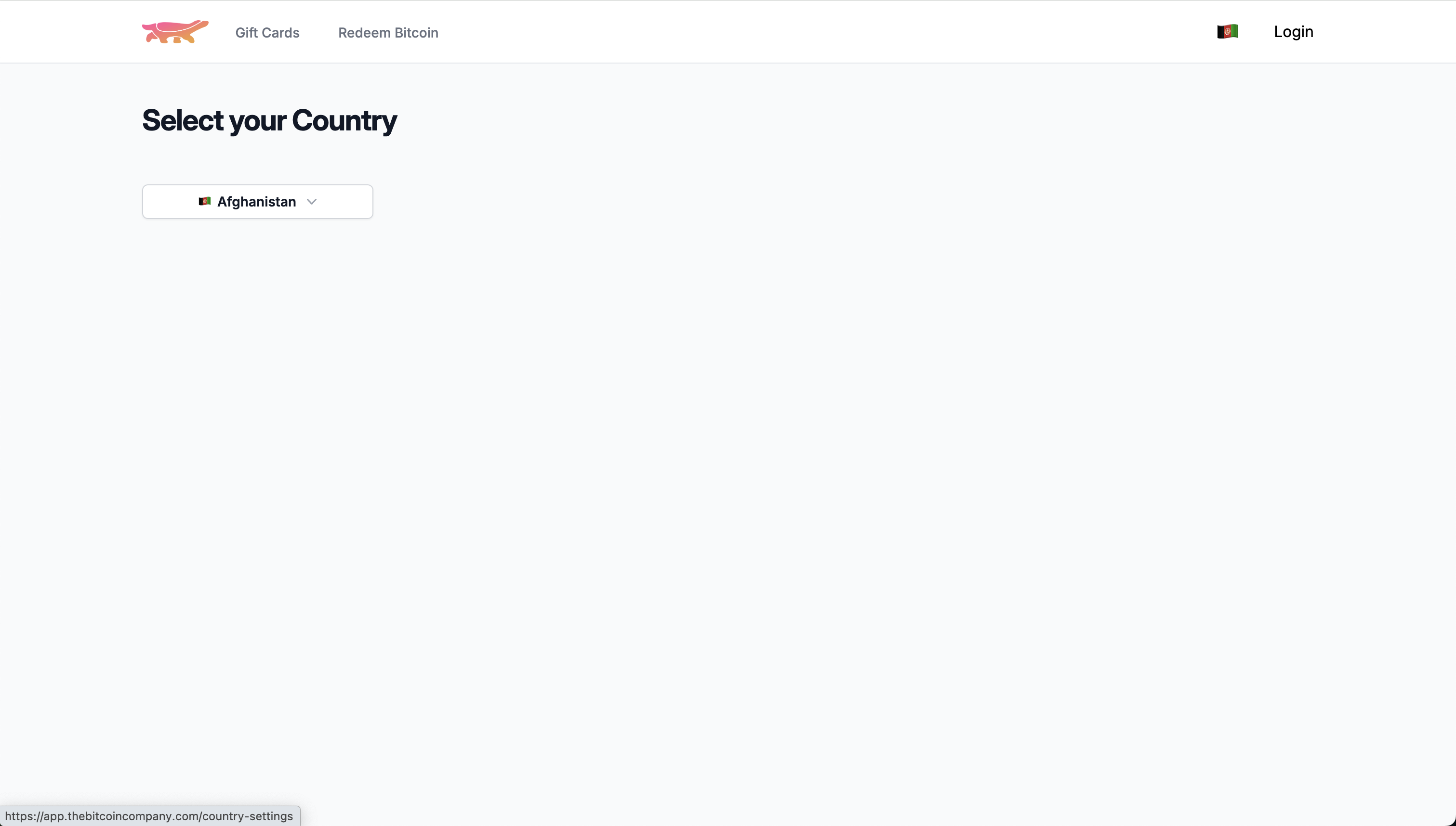
2. Dropdown Component Instead of Redirecting User to a New Page to Change Country
This little change will make the user experience much better.
Instead of redirecting the user to a new page to change country, we can use a dropdown component to let user choose the country and the storelist should be reflected accordingly if we do it right. We are reducing the steps for the user from 3 steps to a single step. Thus, making it more accessible and user friendly.
Here's the before and after:
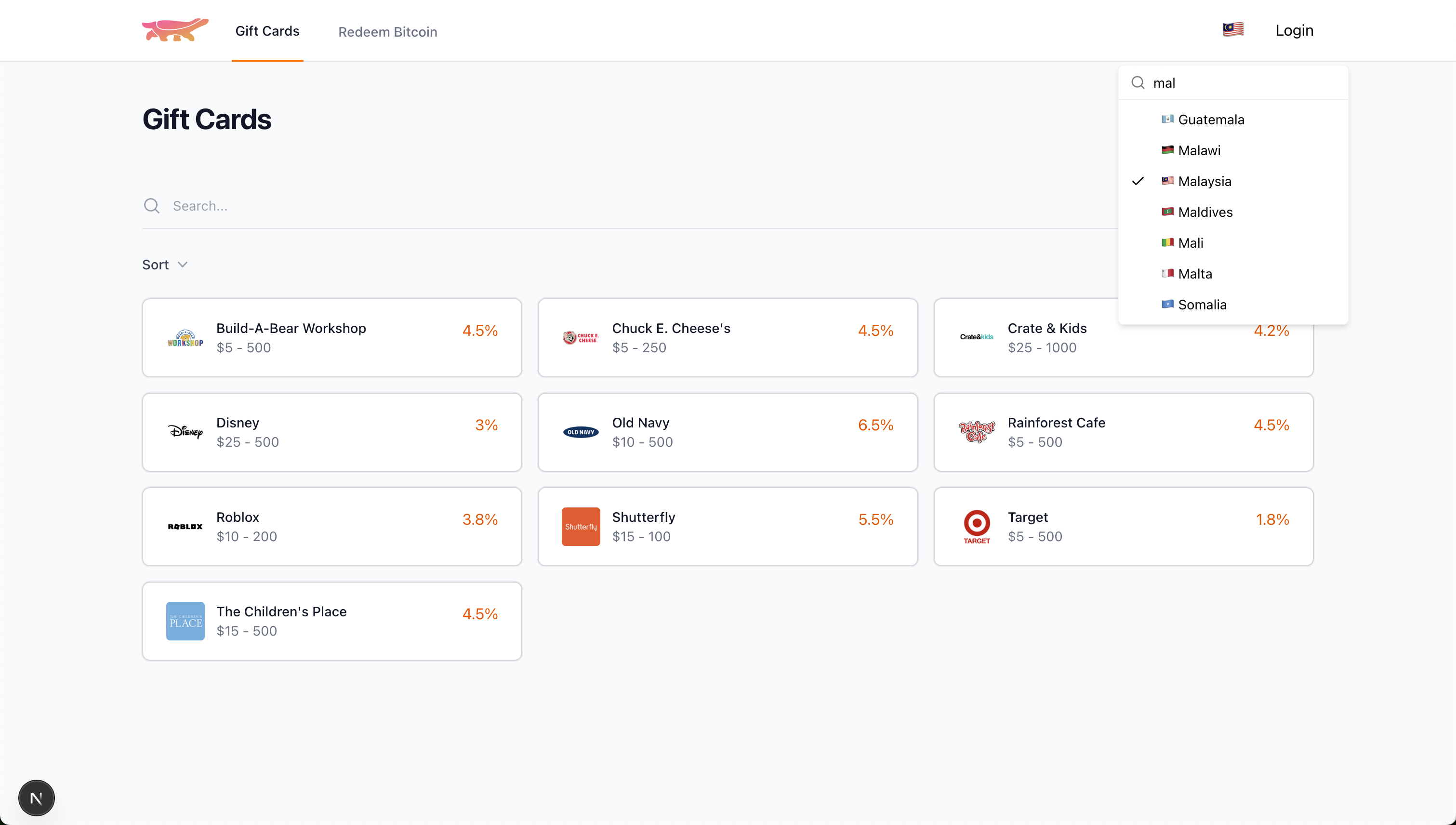
Since The Bitcoin Company web application is using Tailwind CSS, I would like to propose the combination of Popover and Combobox components that is using the same design language as the rest of the application. Here's the code for it.
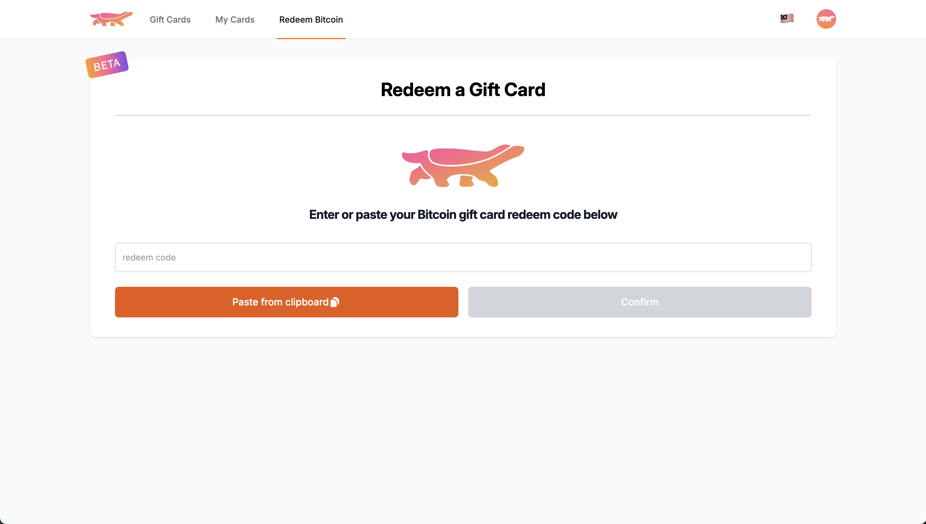
3. Less Wider Form to Look More Professional
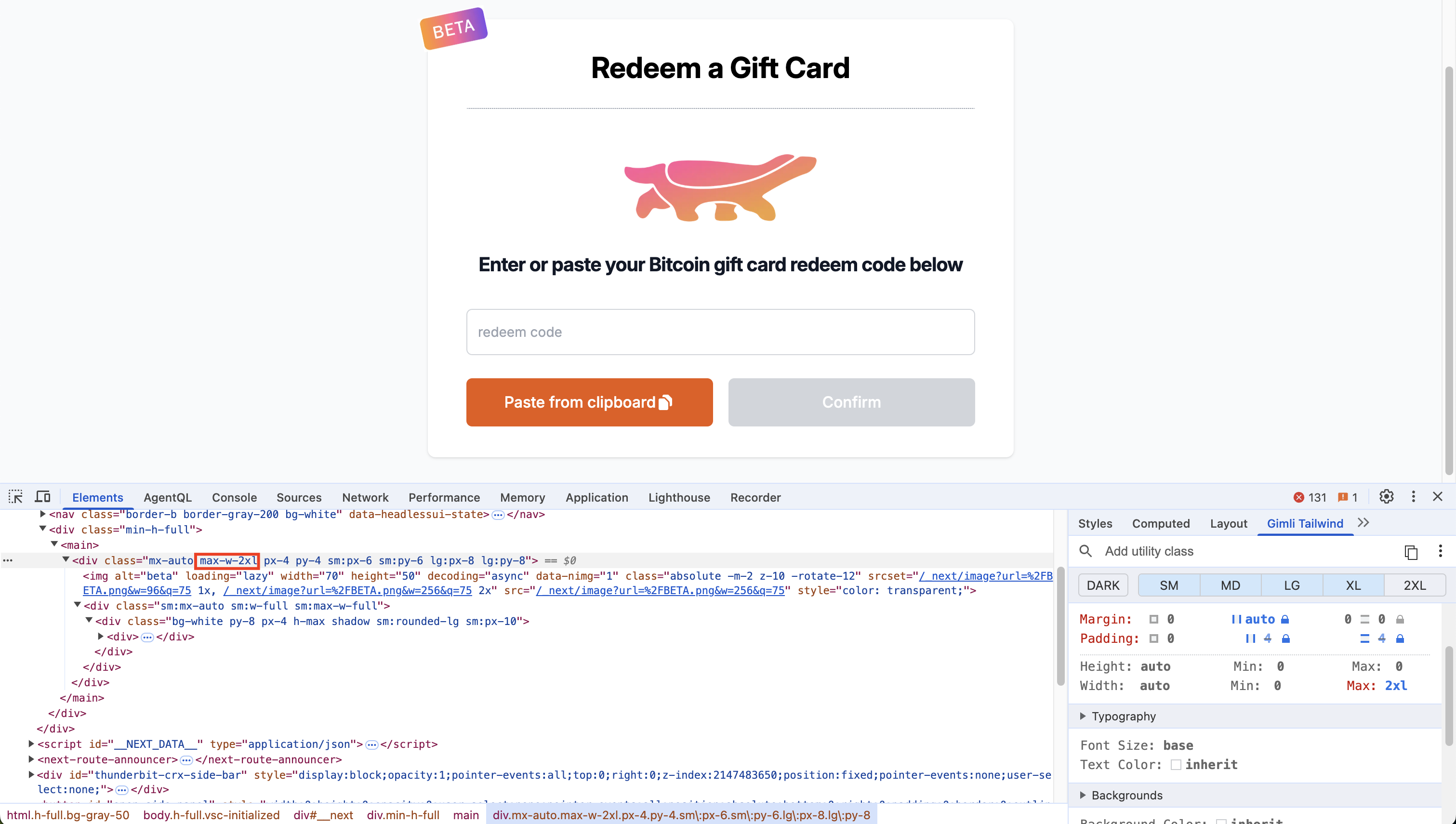
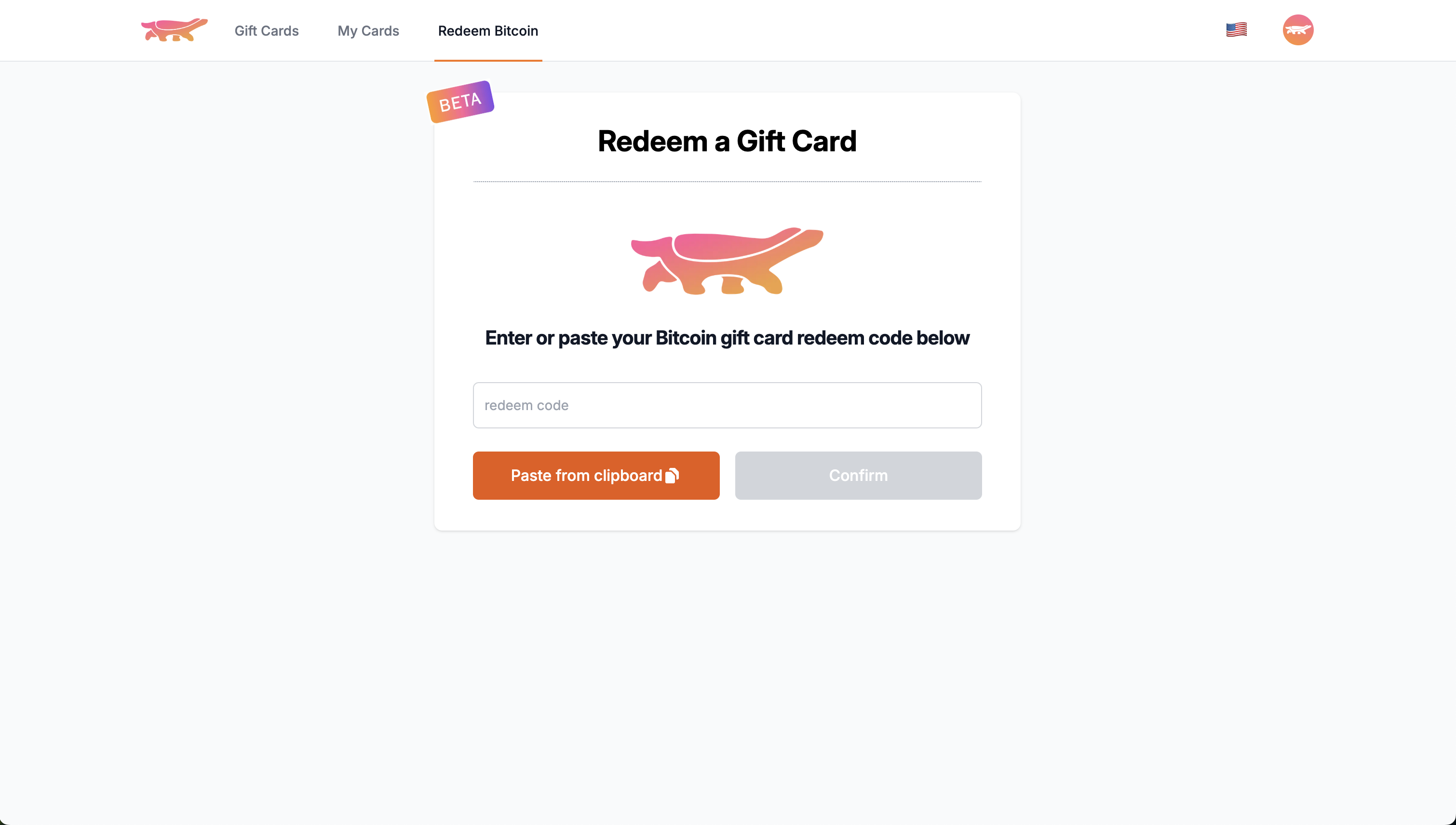
While The Bitcoin Company's primary focus is on their mobile application, I believe these straightforward UI/UX improvements to the web application could provide additional value and enhance the overall user experience of the platform.